Background
Perchwell is a small real estate technology startup based in NYC. After leaving my previous startup and while working on building Reach, I helped Perchwell design their iOS and Android app.
Perchwell's core business is a platform for brokerages and agents to manage the lifecycle of their sale and rental listings. Like Streeteasy and similary apps, the Perchwell brokerage platform also pushes out listings to real state aggregators like Trulia, Zillow etc.
The goal was to redesign the Perchwell App mostly used by real estate professinals with focus on a more consumer friendly experience while maintaining and where possible enhancing the app's utility for agents and brokers.
Project Role
WireframingPrototypingUser TestingVisual DesignInteraction DesignDesign Research
The Perchwell app had originally been designed when the go to market strategy was a consumer facing app inline with existing apps like Streeteasy. It wasn't until talking with brokerages that the company did a quick pivot into building a more enterprise focused tool. In doing so, the initial design was essentially hacked into an enterprise mobile app for brokerages, the goal being to enable agents and brokers to do business and manage their listings on the go.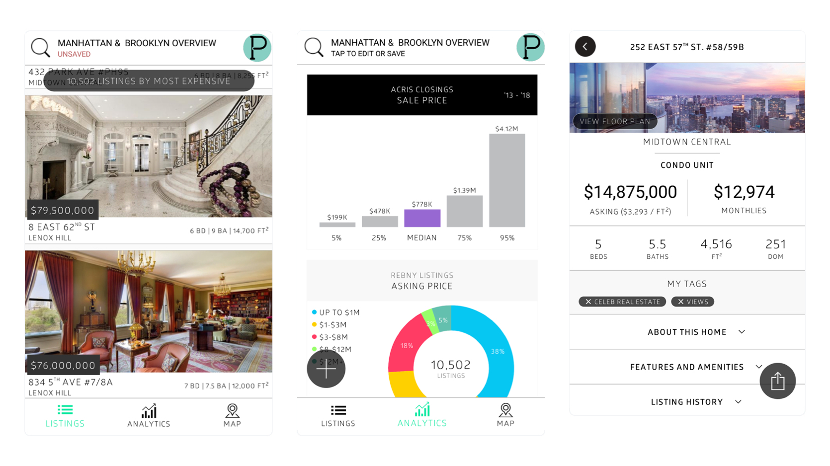 In auditing the existing app, compararing with competitors both on the consumer and enterprise sides, a few things stood out:
- Adapting the initial design rendered the app not very useful in managing listings and clients for already time-pressed agents and brokers
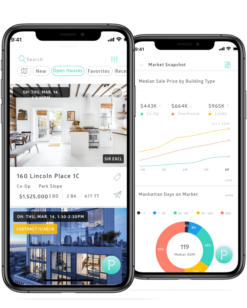
- The analytics feature provided the most additional utility for users, however, for experience NYC real estate professionals, getting a snapshot of the market was not nearly as critically important as being able to manage listings and their client relationships.
- Difficult for users to differentiate between the feeds and saved list views.
- Lacking clean look and visual balance critical for enhancing the experience of consumer apps.
We decided to pursue a design strategy centered around creating a consumer and enterprise friendly app.
Design Approach
The redesign of the app was guided by the following princples - explore seamlessly, search with ease, and simple and beautiul design.
Explore seamlessly
- Drastically cut down on points of navigation in the app and create a centralized hub where users can easily access and discover features of the app.
Search with ease
- Simplify searching for sale and rental properties.
- Give users options of basic and more advanced filtering when searching.
- Simplify saving and returning to searches.
Simple and beautiful design
- Create a clean and reusuable design language and system that can be used for the enterprise desktop product as well as other outward facing experiences.
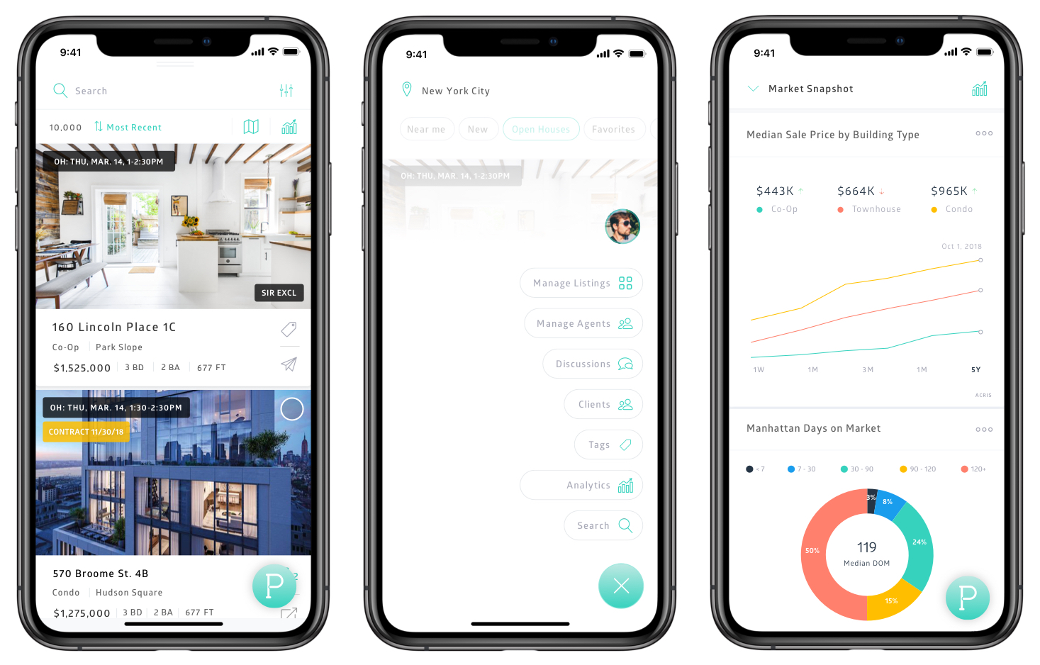 Central hub for navigation and easily switchable views
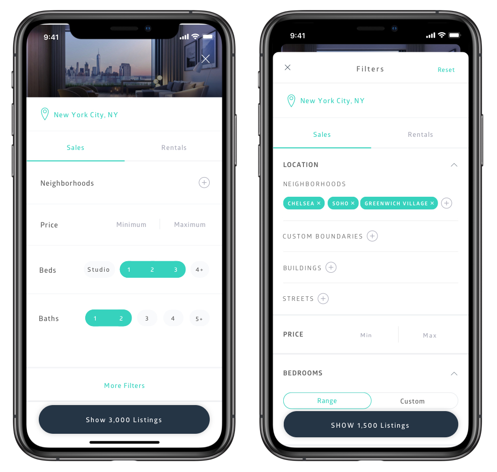 Basic and more advanced search filtering
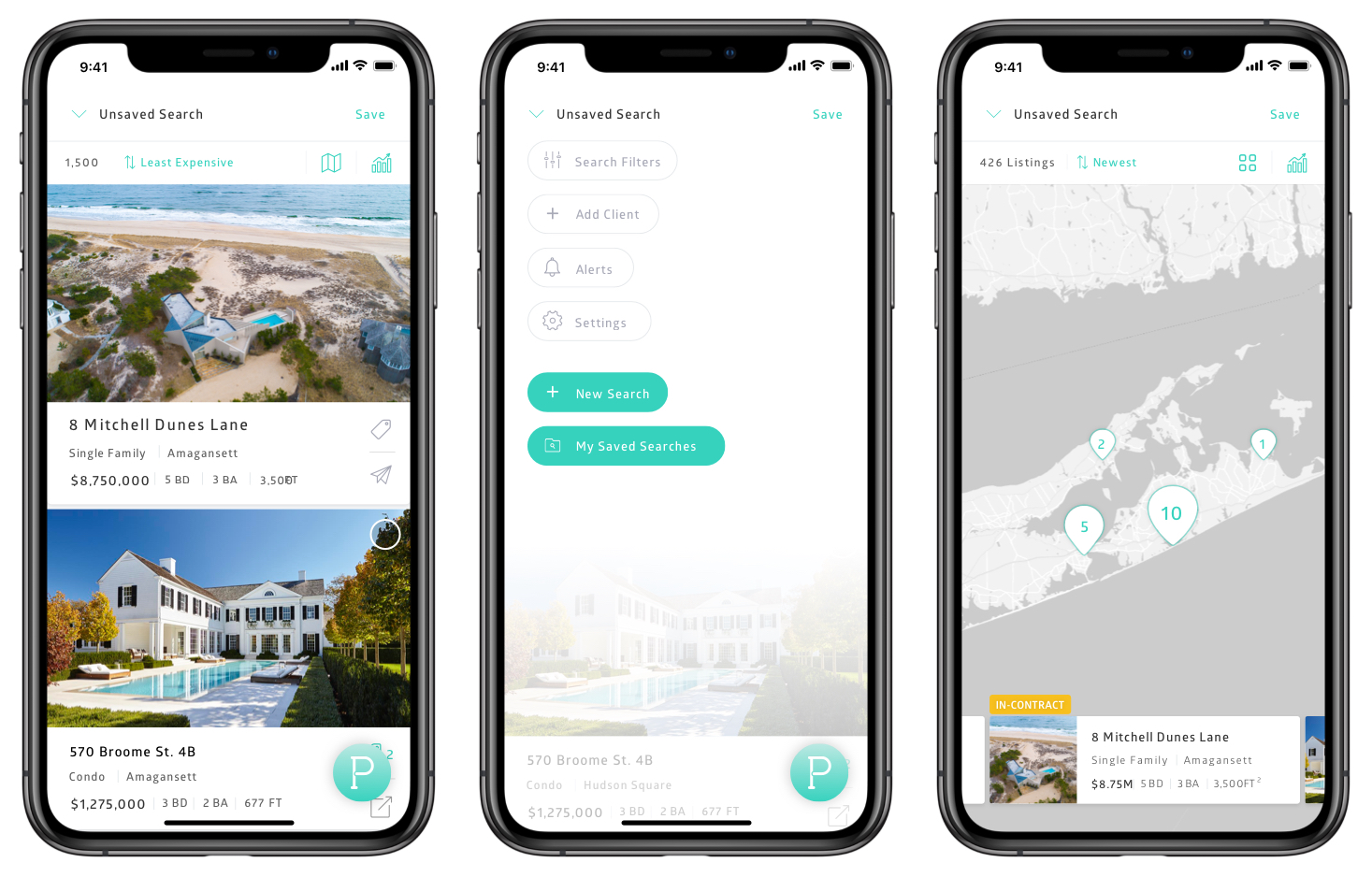 Save and return to your searches
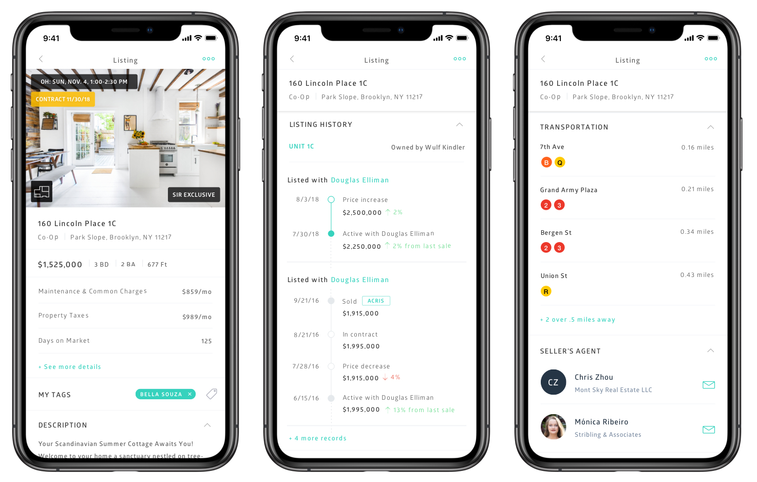 Improved UI for property and listing detail views
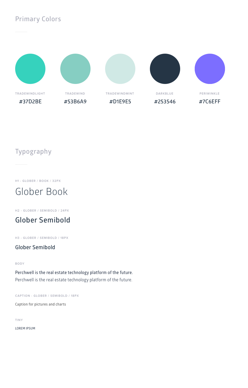 Define color design color palette and typography
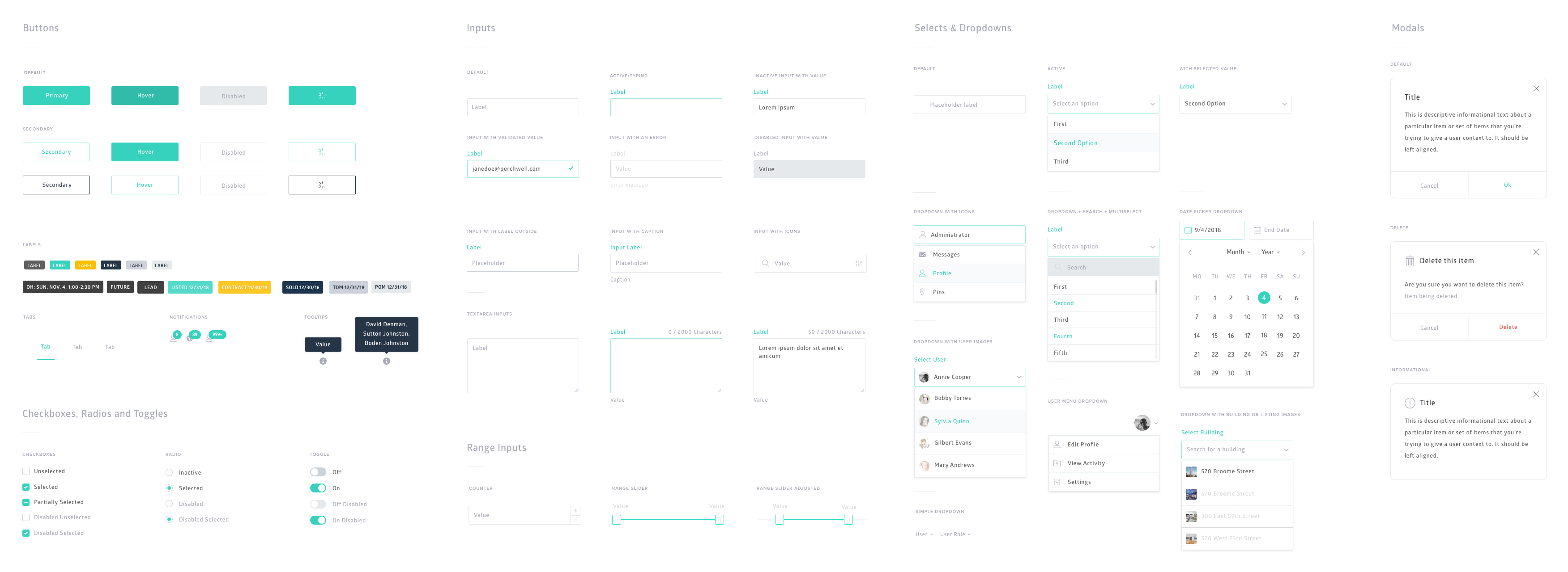 Design system UI components
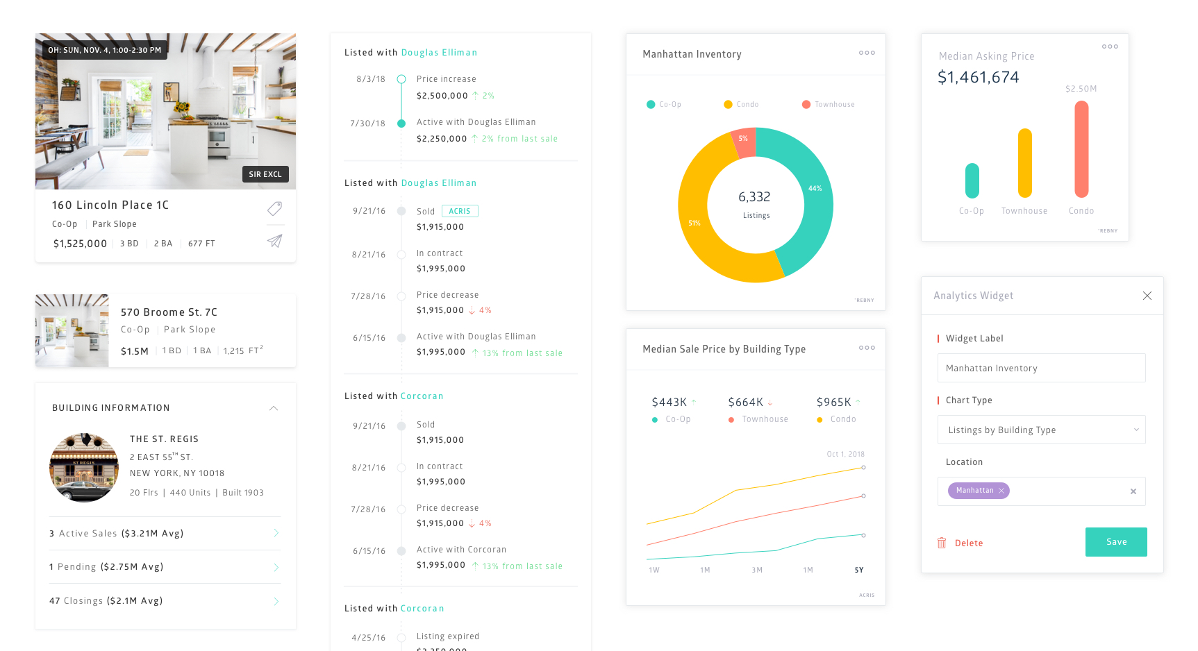 Design system components